In Context
What it might feel like.
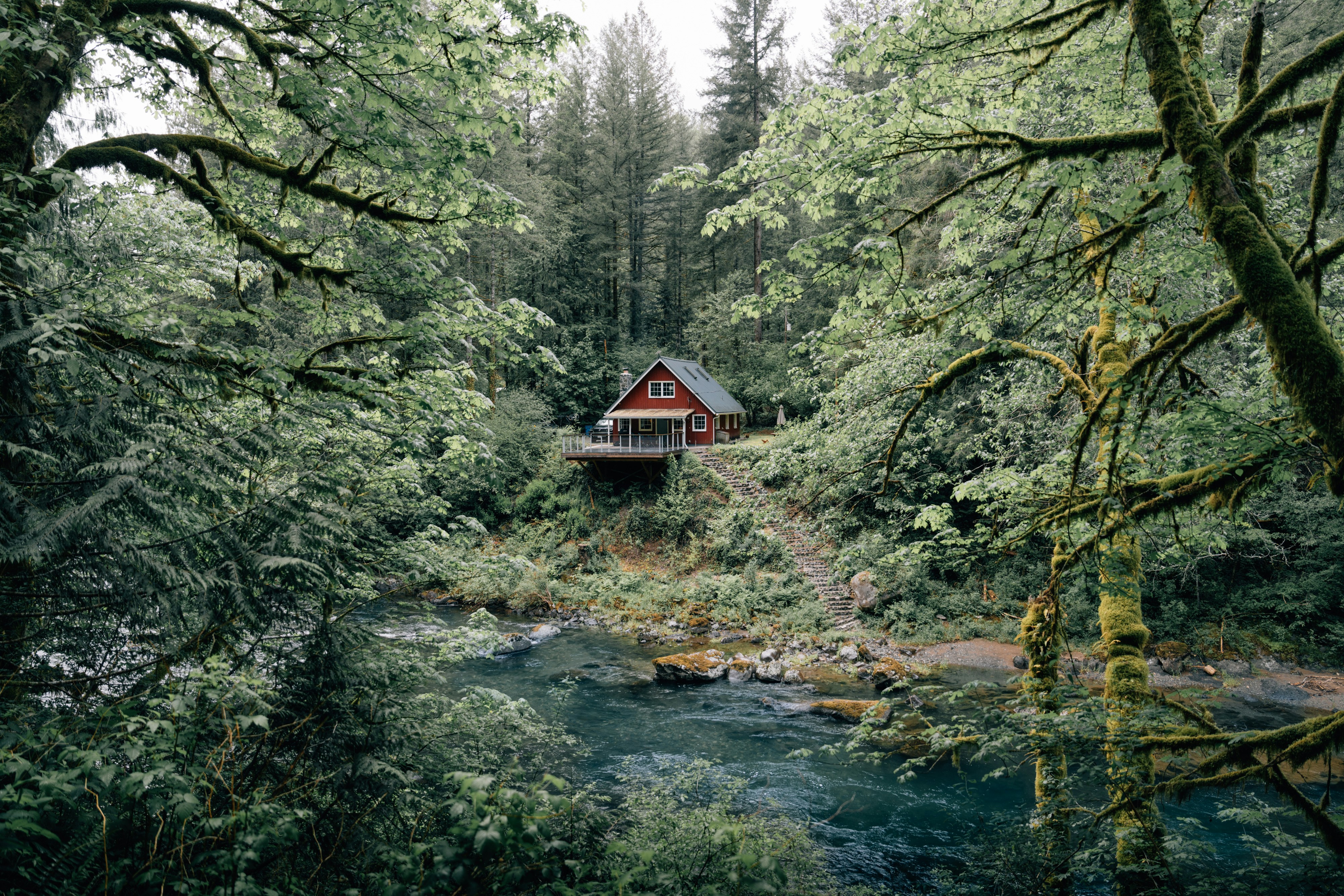
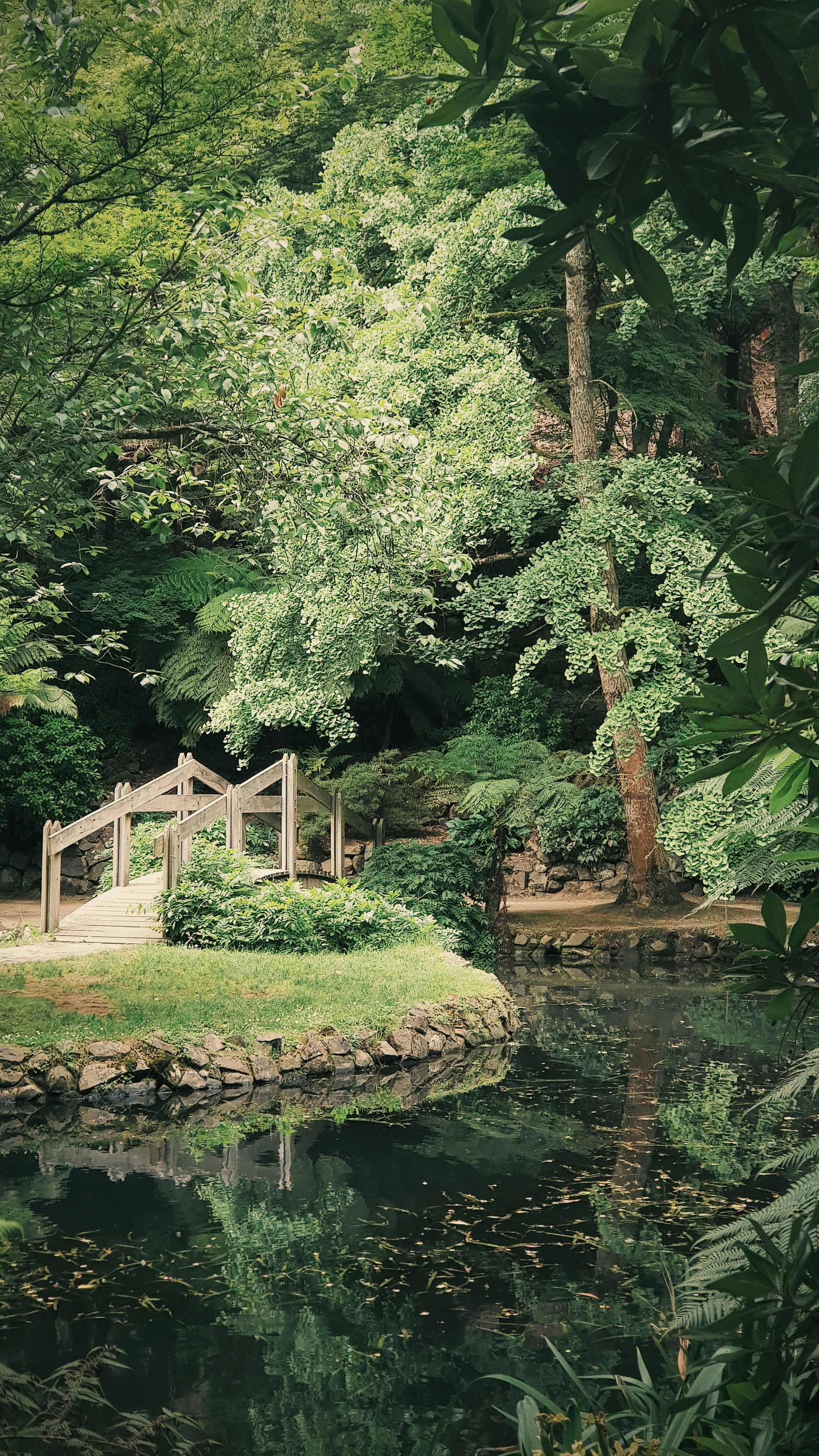
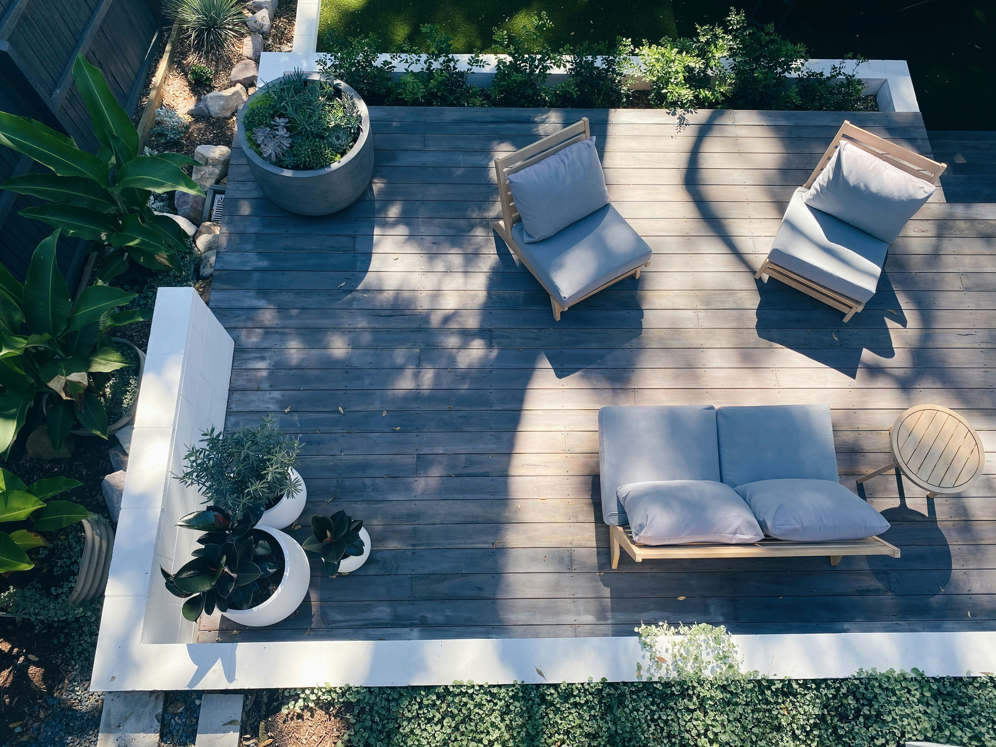
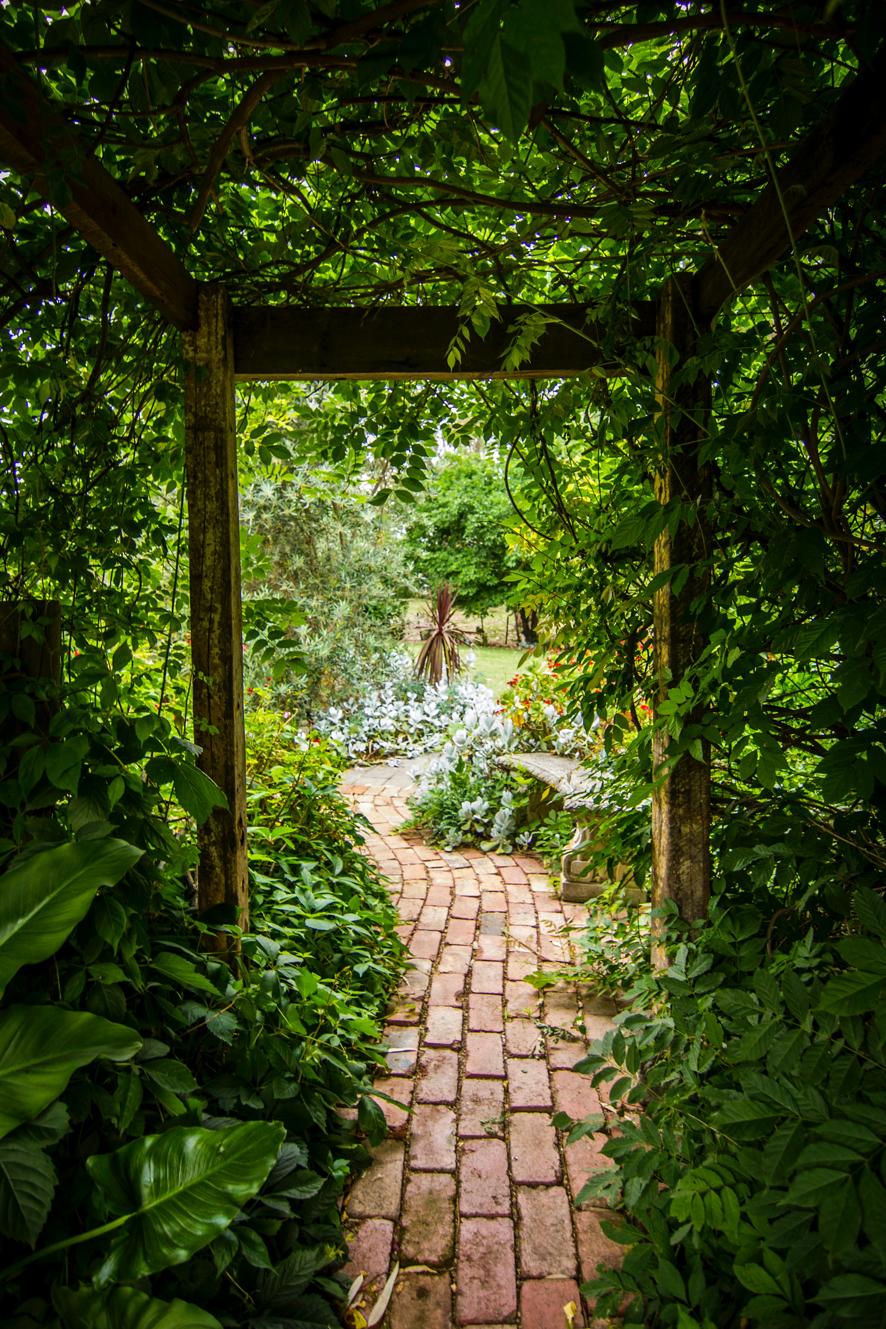
Some quick, rough website sketches to get a bit of a sense of how these type and color systems might come together with some imagery.
Direction 1 / Wordmark Only
MOUNT GARDENER
- Work
- Services
- About
- Contact
LANDSCAPE &
BUILD
BUILD
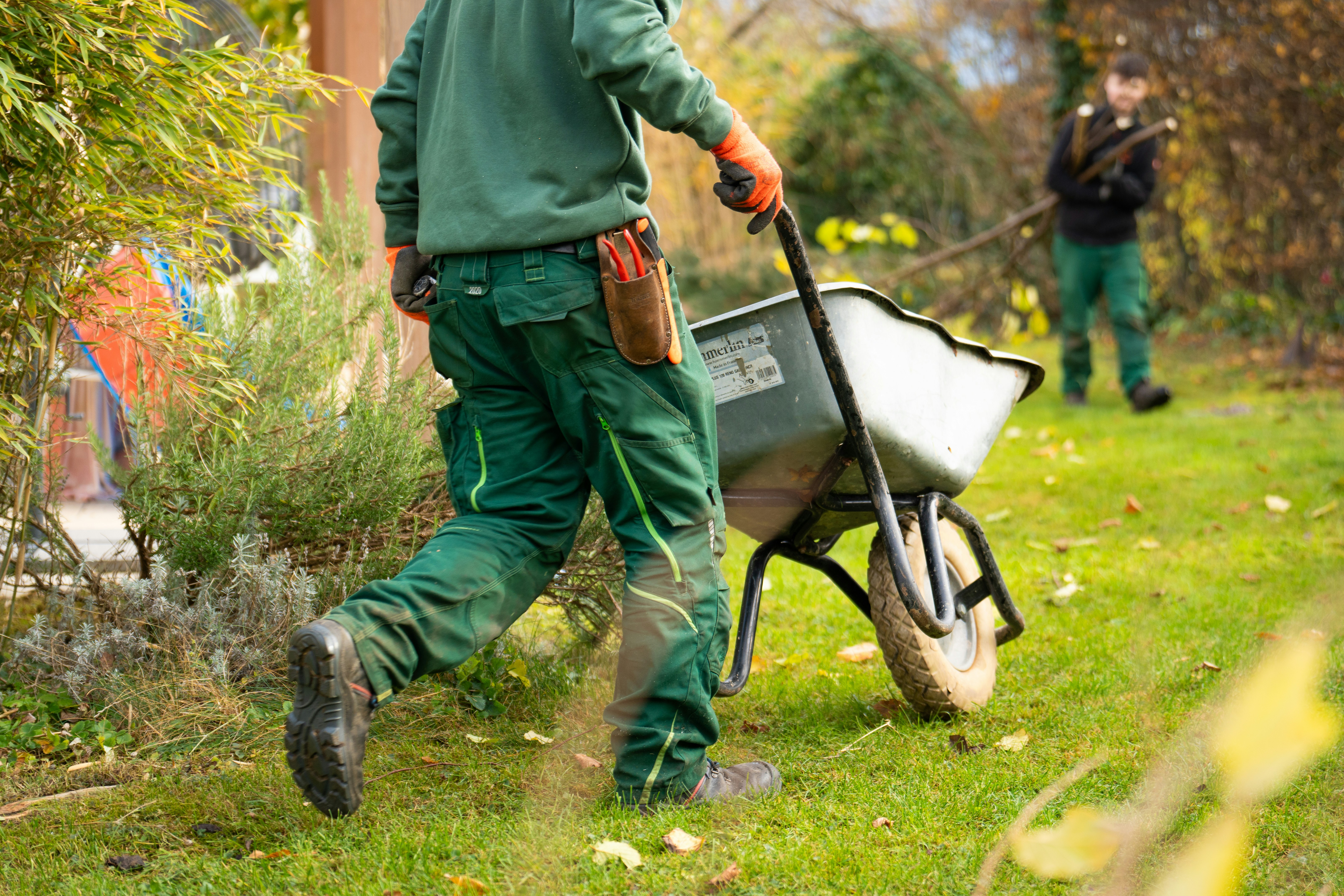
Landscaping, planting, decks, fences, stone paths, saunas. One team on Bowen Island.
What we do
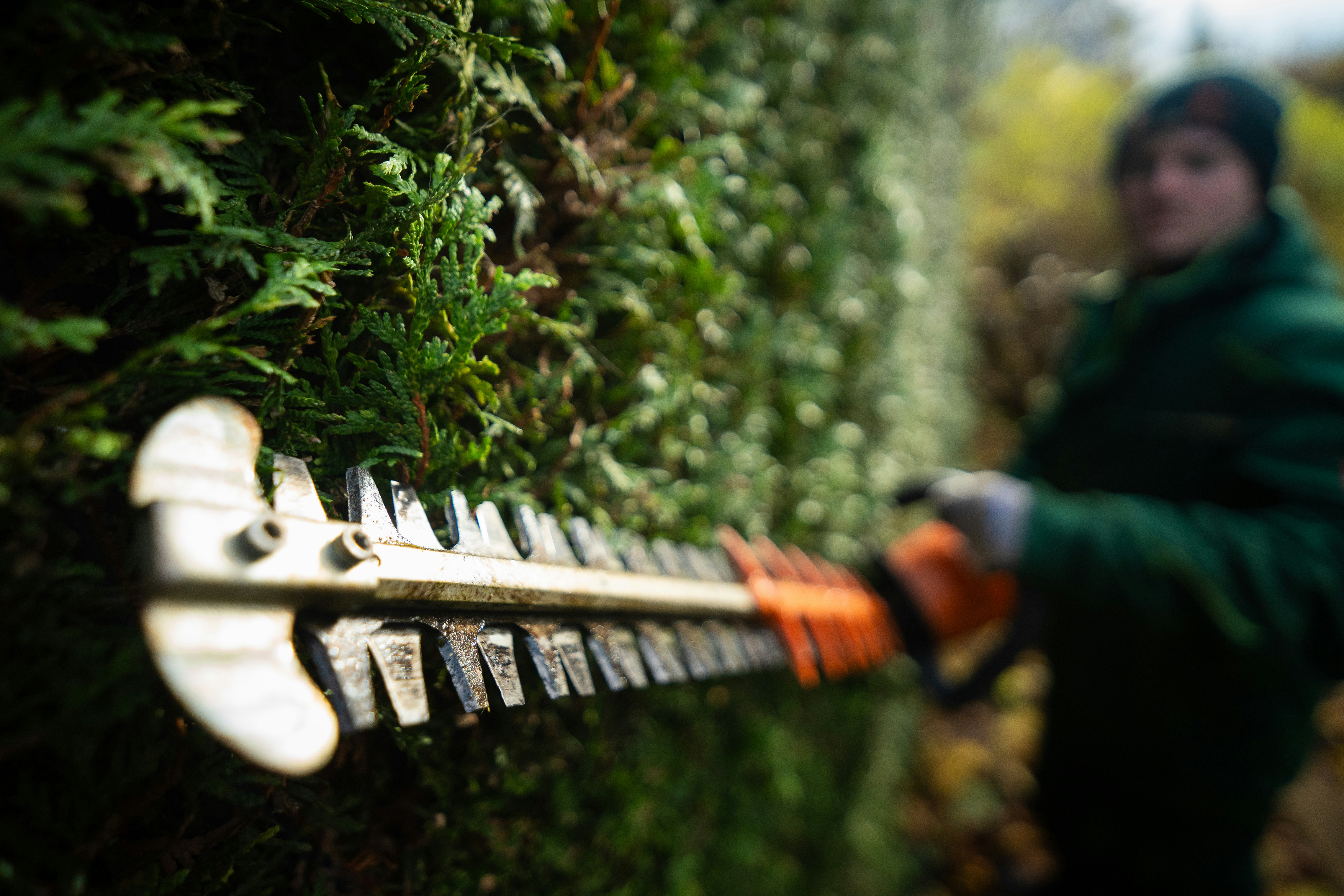
Planting & Gardens
Trees, shrubs, garden beds, seasonal planting
Decks & Structures
Decks, pergolas, planter boxes, saunas
Stone & Paths
Stone steps, pathways, terraces, retaining walls
Recent Work
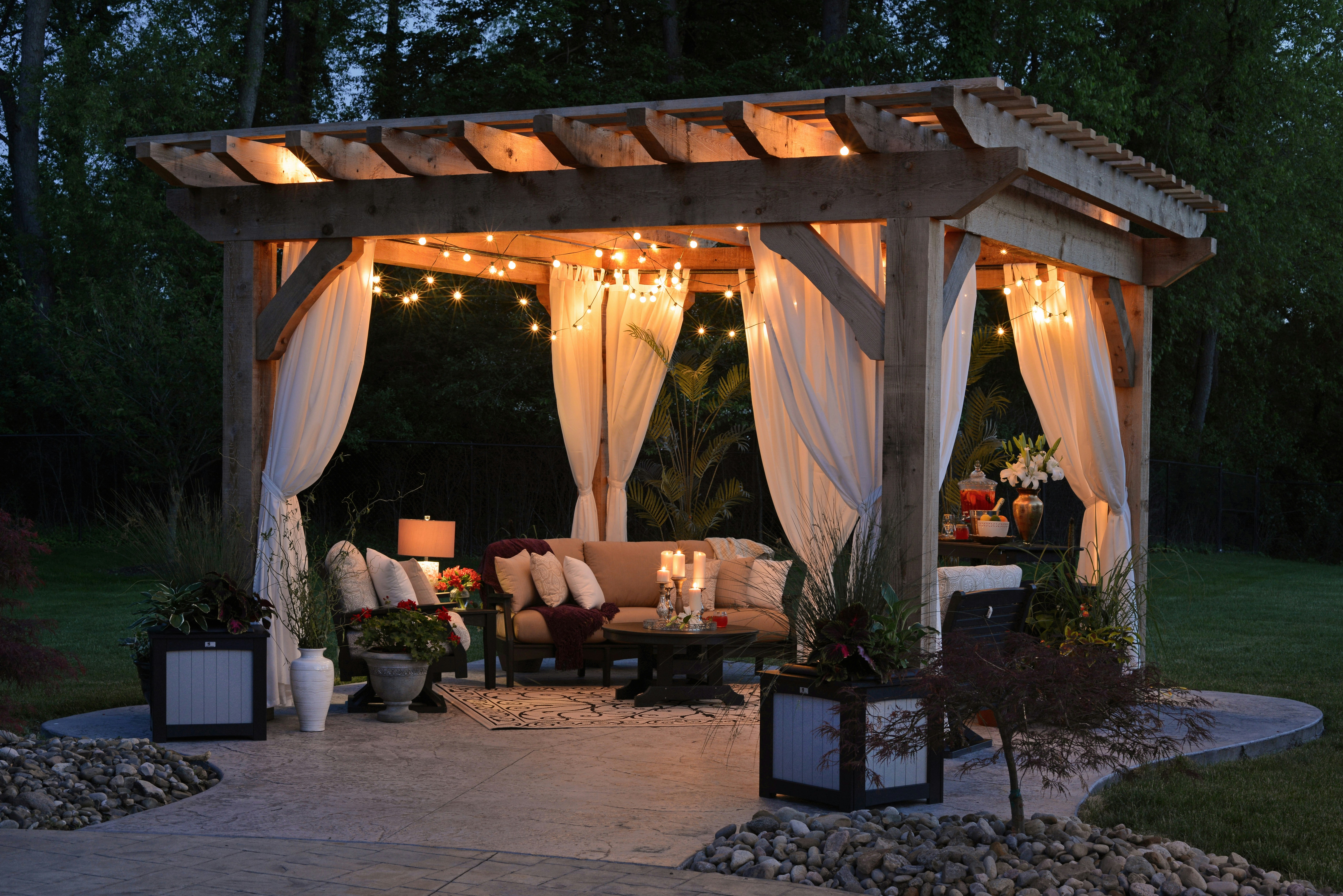
Eagle Cliff Road
Pergola, deck, planting, hedge work
View project
MOUNT GARDENER
LANDSCAPE & BUILD
604.928.8967
info@mountgardener.com
Bowen Island, BC
info@mountgardener.com
Bowen Island, BC
Direction 2 / Brandmark + Wordmark
▲ •
MOUNT GARDENER
- Work
- Services
- About
- Contact
▲ •
MOUNT GARDENER
Landscape & Build / Bowen Island
Your land, considered.
We handle the full outdoor picture. Planting, fences, decks, terraces, garden boxes, stone paths, saunas. One team on the island, one conversation about what your space could be.
Landscape
Trees, gardens, planting, pruning
Build
Decks, fences, saunas, planter boxes
Stone
Paths, steps, terraces, retaining walls
About
A wholistic approach to outdoor spaces from a reliable team on island.
Mount Gardener is a landscaping, planting and carpentry company on Bowen Island. Decks, planter boxes, saunas, fences, stone paths, fire pits, garden beds, tree planting. The kind of work that usually falls through the cracks after the builder finishes the house and leaves. We do all of it, and we're already here.
▲ •
MOUNT GARDENER
LANDSCAPE & BUILD
604.928.8967
info@mountgardener.com
Bowen Island, BC
info@mountgardener.com
Bowen Island, BC